Marmi
Skin Care
Branding
Creative Direction
Visual Identity
Typography
Packaging
Skin Care
Branding
Creative Direction
Visual Identity
Typography
Packaging
MARMI: For Daring Skin Types
In a market driven by perfection, individuality is often diluted, replaced by uniform ideals and predictable codes. MARMI challenges this standard. Not by adding noise, but by redefining what beauty looks and feels like. A brand built to reflect diversity with clarity, speaking to all, without compromise.
Insight
Beauty brands often rely on aspiration over authenticity, creating distance rather than connection.
The opportunity was to translate inclusivity into a tangible system—where clarity, balance, and expression coexist, and where every element reflects a more honest, contemporary vision of beauty.
Concept
Bold Simplicity
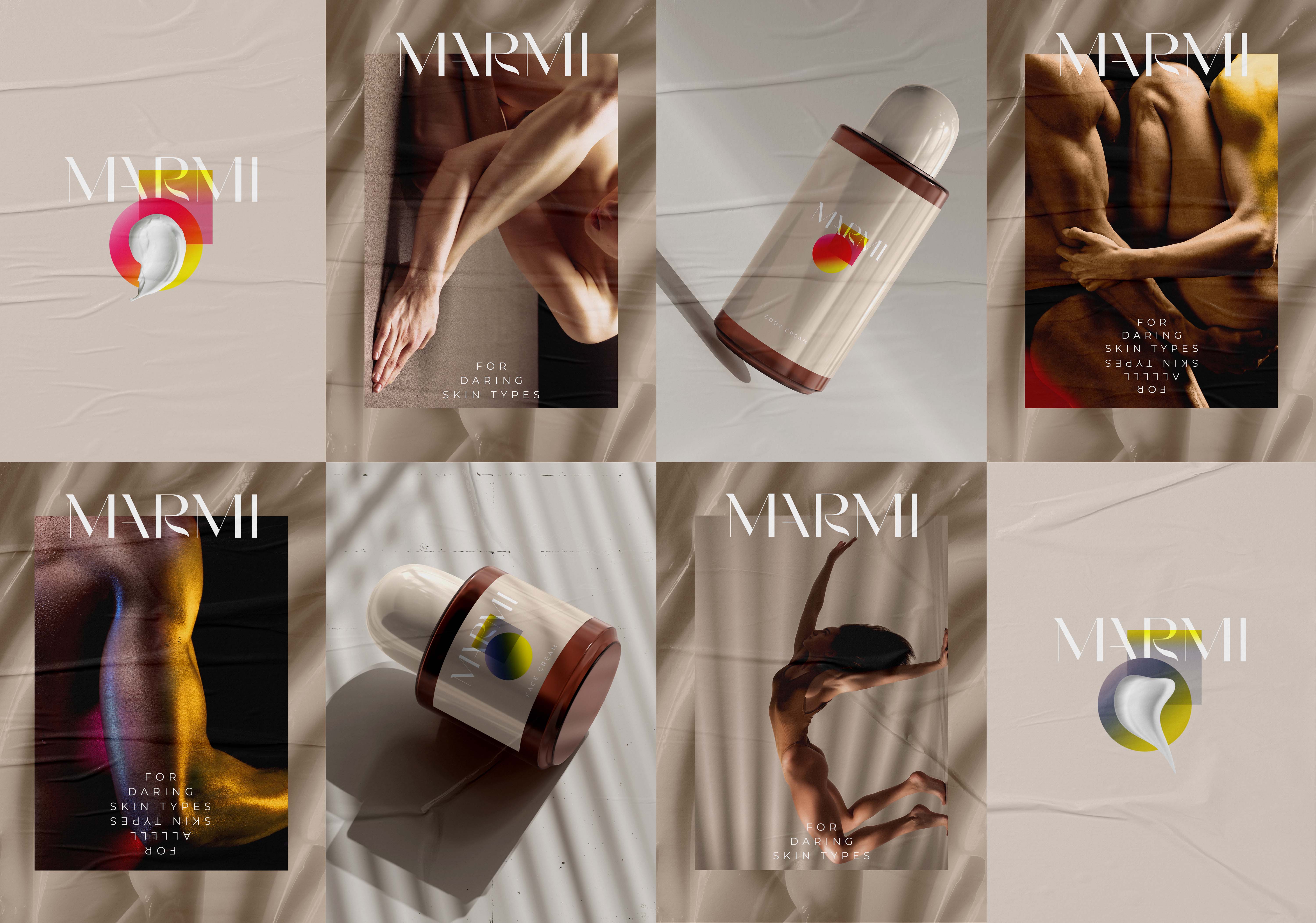
A concept-driven visual language that balances minimalism with expressive intent—where restraint creates space for individuality, and messaging becomes a defining brand asset.
Rather than over-designing, the system amplifies what matters: identity, diversity, and presence.
Design System Logic
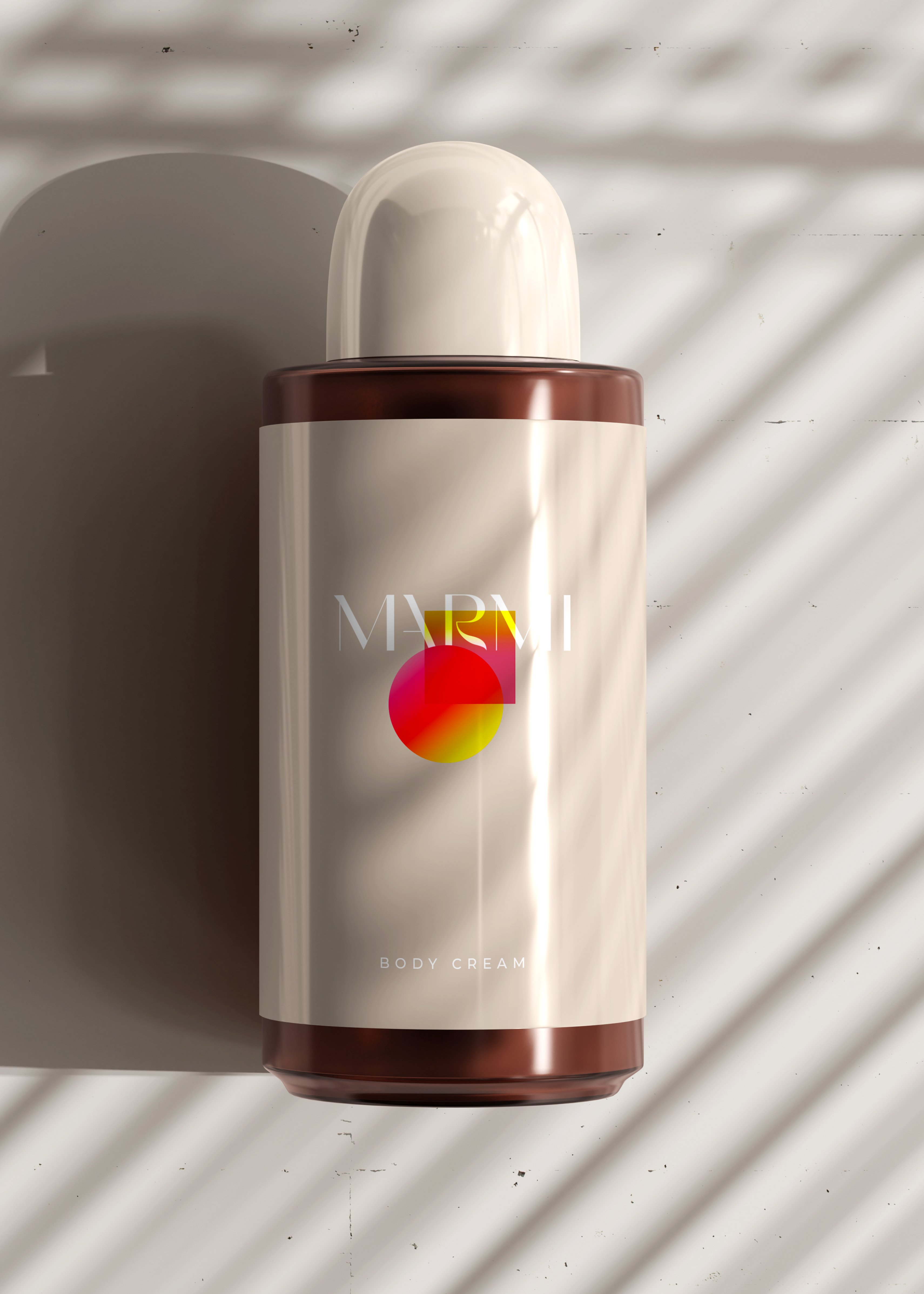
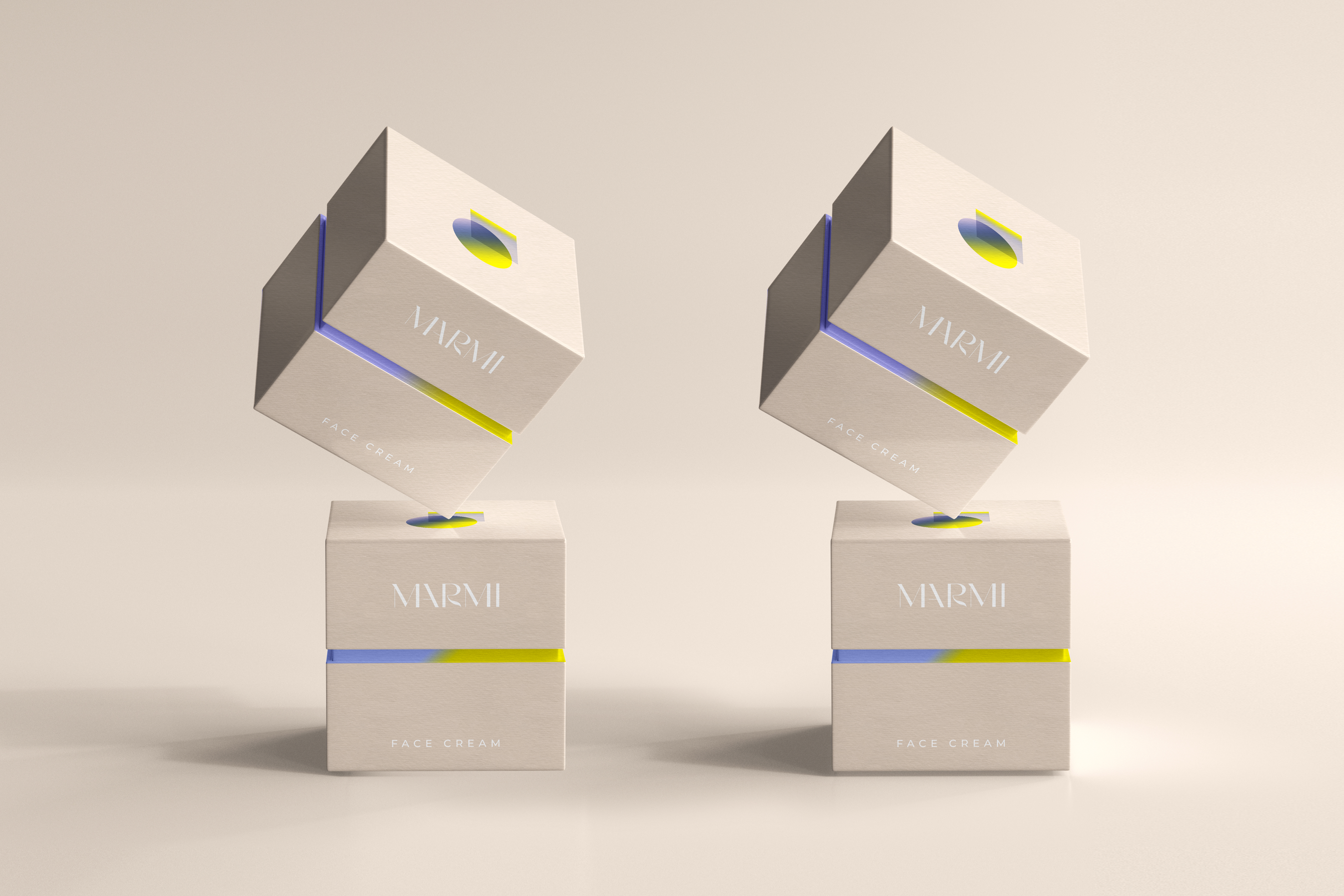
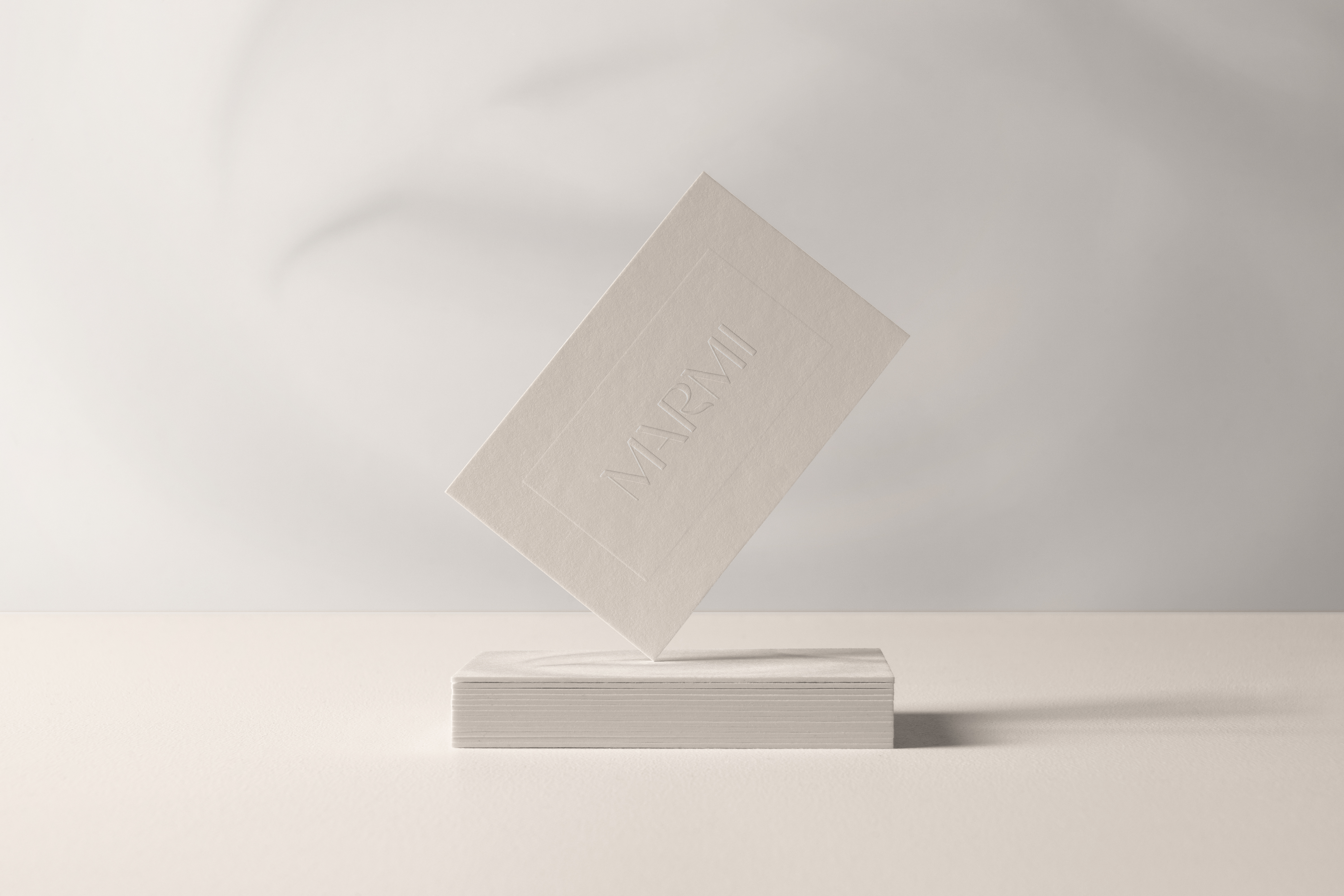
The system is grounded in clean, precise typography that communicates clarity and confidence. Packaging becomes an extension of the brand’s values, combining sustainability with refined execution. A flexible visual framework allows the identity to evolve across product lines while maintaining coherence, ensuring consistency without limiting expression.
In a market driven by perfection, individuality is often diluted, replaced by uniform ideals and predictable codes. MARMI challenges this standard. Not by adding noise, but by redefining what beauty looks and feels like. A brand built to reflect diversity with clarity, speaking to all, without compromise.
Insight
Beauty brands often rely on aspiration over authenticity, creating distance rather than connection.
The opportunity was to translate inclusivity into a tangible system—where clarity, balance, and expression coexist, and where every element reflects a more honest, contemporary vision of beauty.
Concept
Bold Simplicity
A concept-driven visual language that balances minimalism with expressive intent—where restraint creates space for individuality, and messaging becomes a defining brand asset.
Rather than over-designing, the system amplifies what matters: identity, diversity, and presence.
Design System Logic
The system is grounded in clean, precise typography that communicates clarity and confidence. Packaging becomes an extension of the brand’s values, combining sustainability with refined execution. A flexible visual framework allows the identity to evolve across product lines while maintaining coherence, ensuring consistency without limiting expression.